Wednesday, March 31, 2010

g ♥


zimbio

gaia repossi has some amazing looks! i love the rings from her line ♥

phoebe philo


thegentlewoman s/s 2010

this woman is a genius! i really miss her chloé days.

Monday, March 29, 2010

camel


mr.newton

ahhhhh! love!!! that coat?!

JAPANESE SAMURAI


MONO CHROME or METALLIC colour with full of Sequins WE observed in MANISH ARORA's and GAURAV GUPTA's collection.......What should I actually talk about??? No wonder m confused by saying this to my readers..... Which one me say love most. Let’s start with PANKAJ & NIDHI’s collection...I would have written about them at the day they showcased their work....but i need to re-asses the entire collection,,,when I actually got time to interview and ask my all self made queries.....fantastic show, as it was ....but the garment as fantastic too????. I asked PANKAJ, about their collection & the story behind it...Intricate work, which probably took long time to complete ... (2 days to 25 days shhhh!!!!!) for each garment


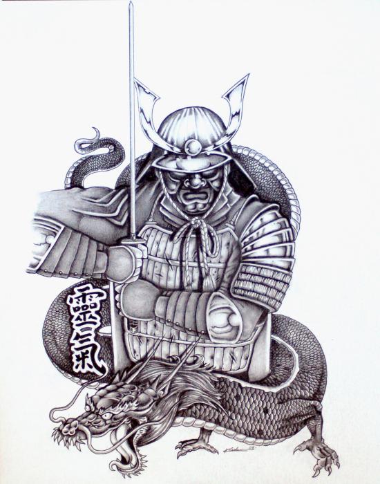
Japanese Samurai or warrior........

...... Japanese art and motif as well reflecting in Pankaj & Nidhi’s collection. Futuristic shapes or silhouettes, Japanese inspired Sleeves, voluminous but controlled.
Dresses ,jumpsuits were not just garments.......... they were highly treated by hand from handmade motifs which were Japanese EMBLEMS 
and of course Op Art....... mixed in it. How can I forget about Op art..............? 


illusions creating images which you might seeing many times............never made me hypnotized as much PANKAJ&NIDHI’s collection did.


“Acknowledgement to FDCI”

MoniCa singh

Rodarte X Maggie Cheung Joyce A/W images only........ Mesmerizing !


MoniCa singh

Friday, March 26, 2010

THE DUSTY start to SHINING STAR

.>>>>>When I posted about Amit aggarwal yesterday, what I failed to say was that by no means was I making out like "This is the most AMAAAAZING thing I've seen ever...!".  Actually, let's just get it out there - when you're posting 3+ times a day, not everything will be TOTALLY original, TOTALLY brilliant and TOTALLY super duper unfortunately.  For some posts, I'm merely sowing the seeds of curiosity about a young designer and putting it out there for contemplation.  Like Maestro's first collection which perhaps doesn't say everything she wants to say about her as a designer, I'm likewise holding out on gushy praise about Franziska Fuerpass and George Bezhanishvili's first womenswear collection given that I can only go on one silhouette for the moment.  Fuerpass and Bezhanishvili are based in Vienna, Austria an if you do a bit of Google work on their names individually, I think I gathered they have worked individually as standalone designers.  They have come and joined forces and dropped me a sneak preview of one garment (photographed here by Andreas Waldschuetz) from their collection which they're presenting at a forthcoming arts and fashion competition in Bilbao.  So quite literally, this is a singular seed that forms the basis of their collection and of course will need a further re-assessment once the whole collection is available to see.  
Inspired by Louise Bourgeois' work, the duo have used bleached tapestry with a ruffled surface to mould voluminous shapes around the body with deliberately raw edges, padded necks, pockets and emphasised shoulders breaking up the sensual draping.  Every piece in the collection is supposed to be a collage and whilst someone mentioned Michael van der Ham when talking about Silvina Maestro's work, van der Ham's collaging techniques evolve into something more seamless and less patchworky here.   


Apparently there are also other textures at play in the other silhouettes... lamb's wool, structured organza, mohair, leather and recycled fur... I'm hoping the dusty colours that the duo have injected into their first dress remains in the rest of the collection because the texture together with that dusky pink back immediately made me recall yet another Dazed editorial (this could be work withdrawal symptoms at play here?), from the February 2010 issue, photographed by Ben Toms and styled by Katie Shillingford.  I've really been feeling these colours that whilst technically could be called pastel, sound a lot better in my head when I call them 'dusty'... pale colours that are dulled somewhat by an imaginary settled layer of chalk dust.... 


MoniCa singh